Work
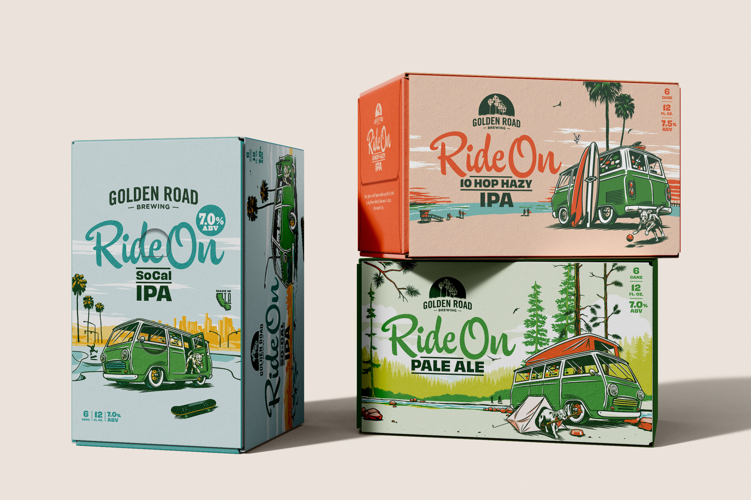
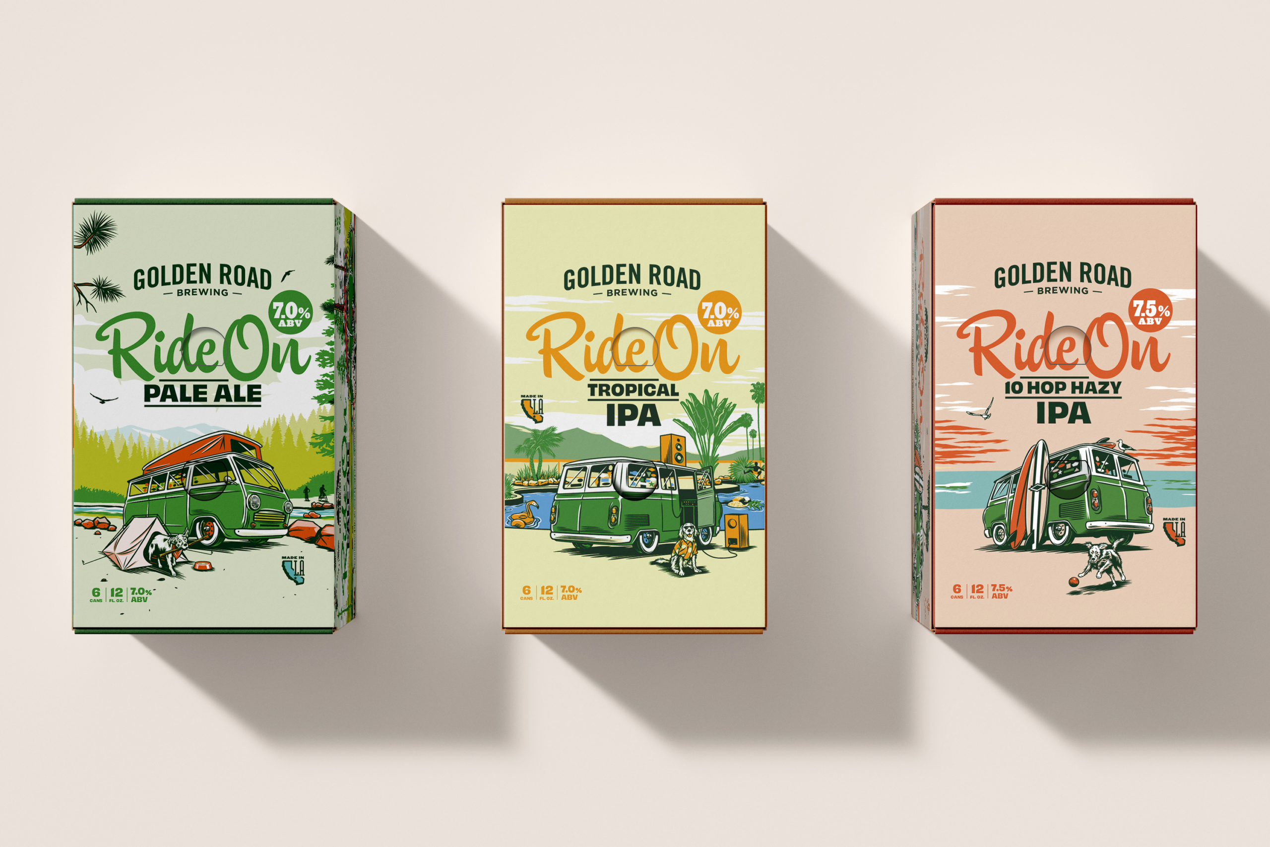
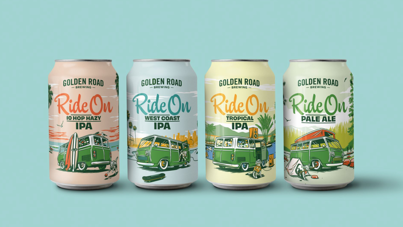
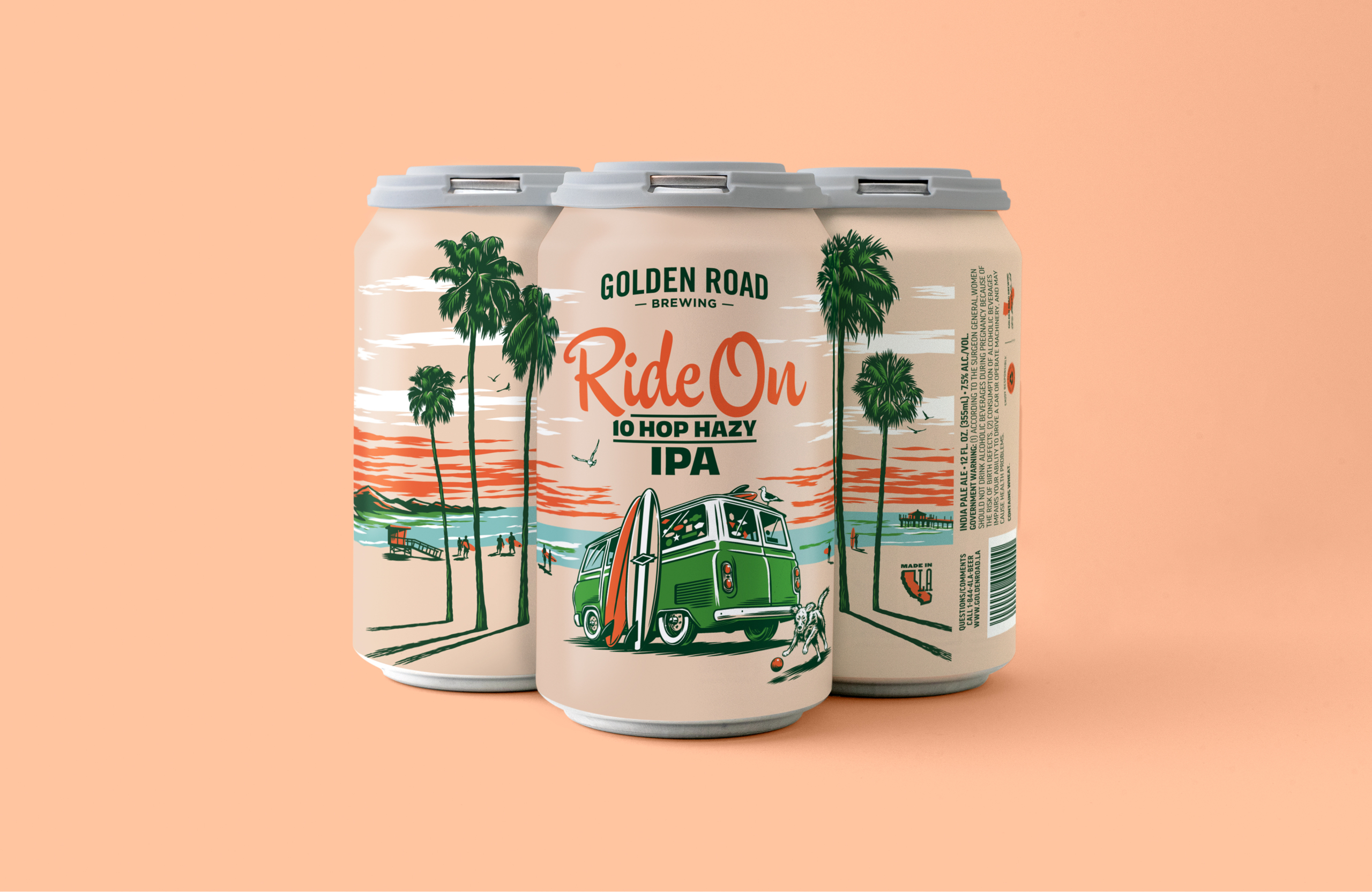
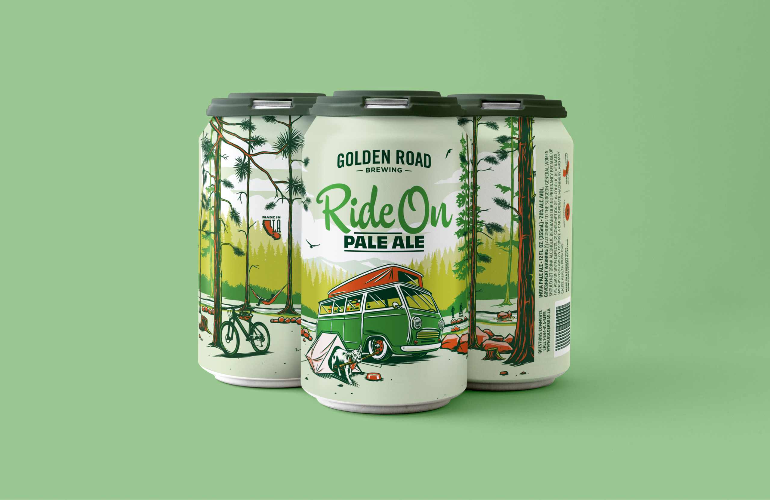
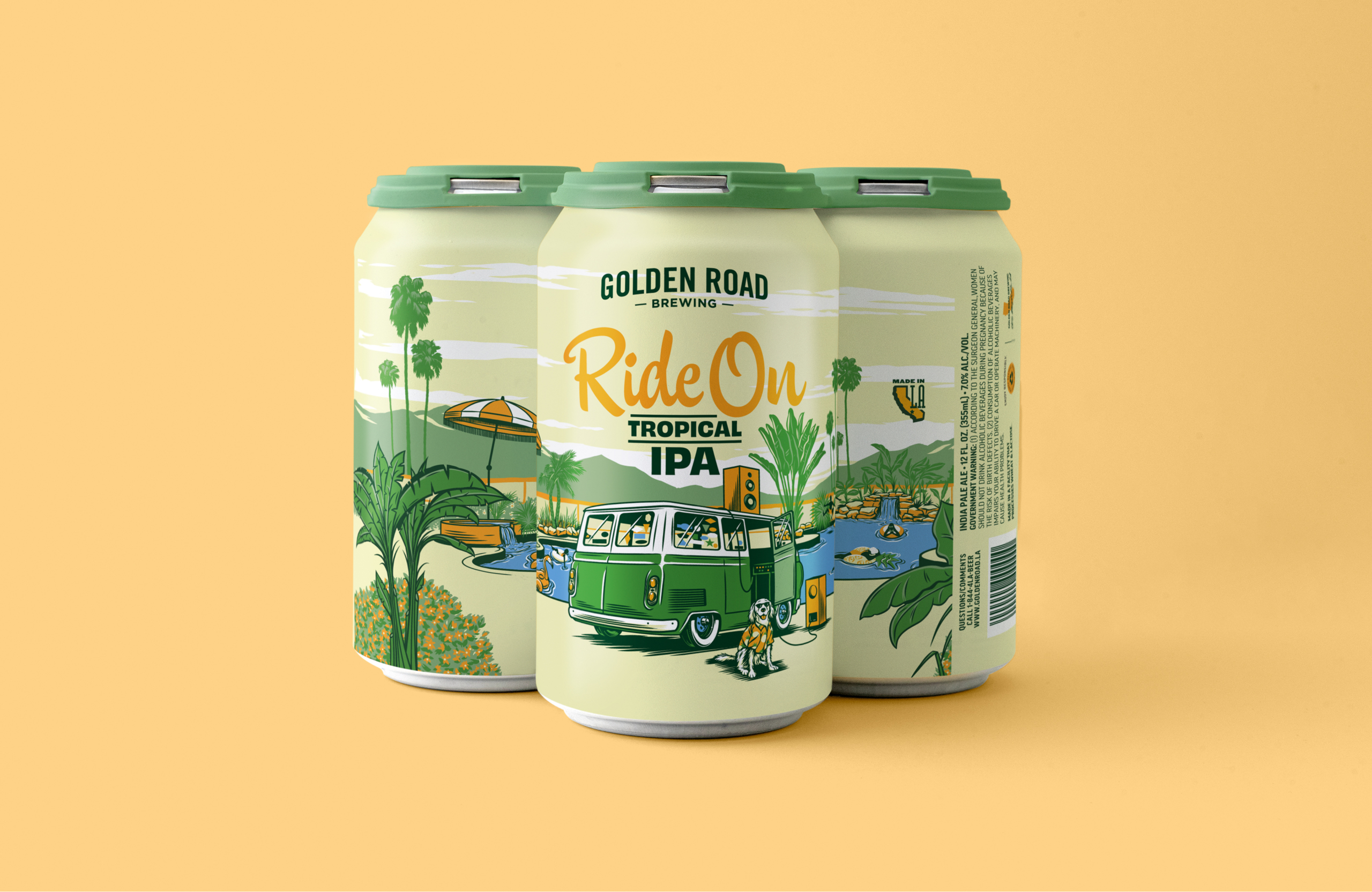
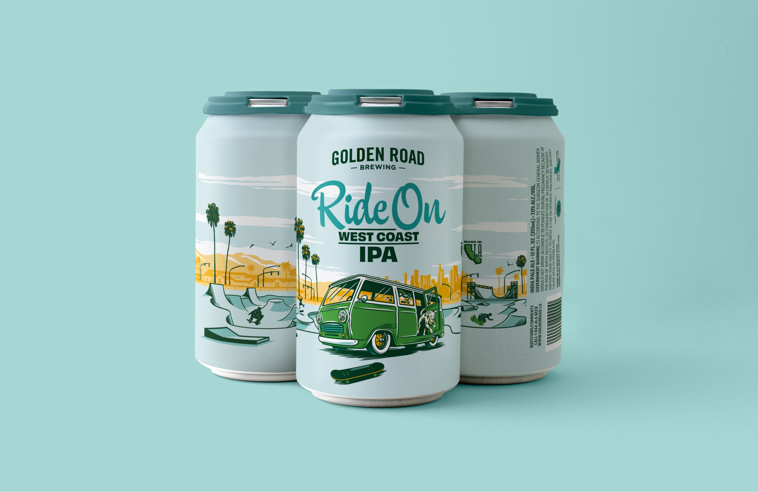
Golden Road was born in Los Angeles and we wanted to give its new IPA series a look that celebrated its SoCal roots — and separated it from the myriad macho competitors in the craft space.
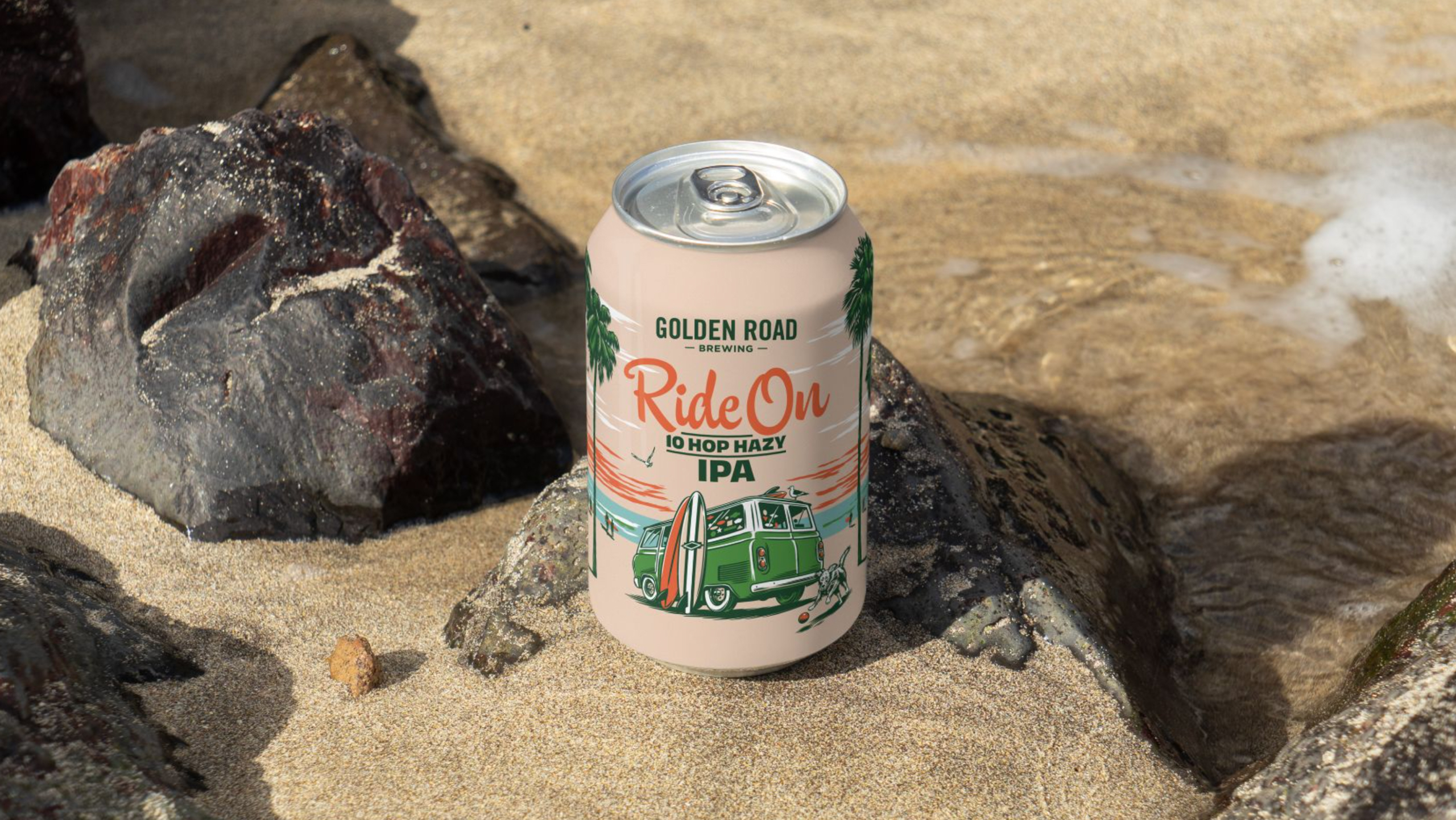
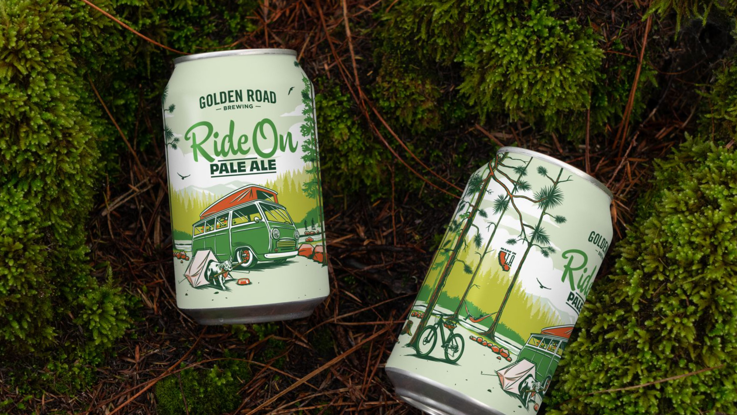
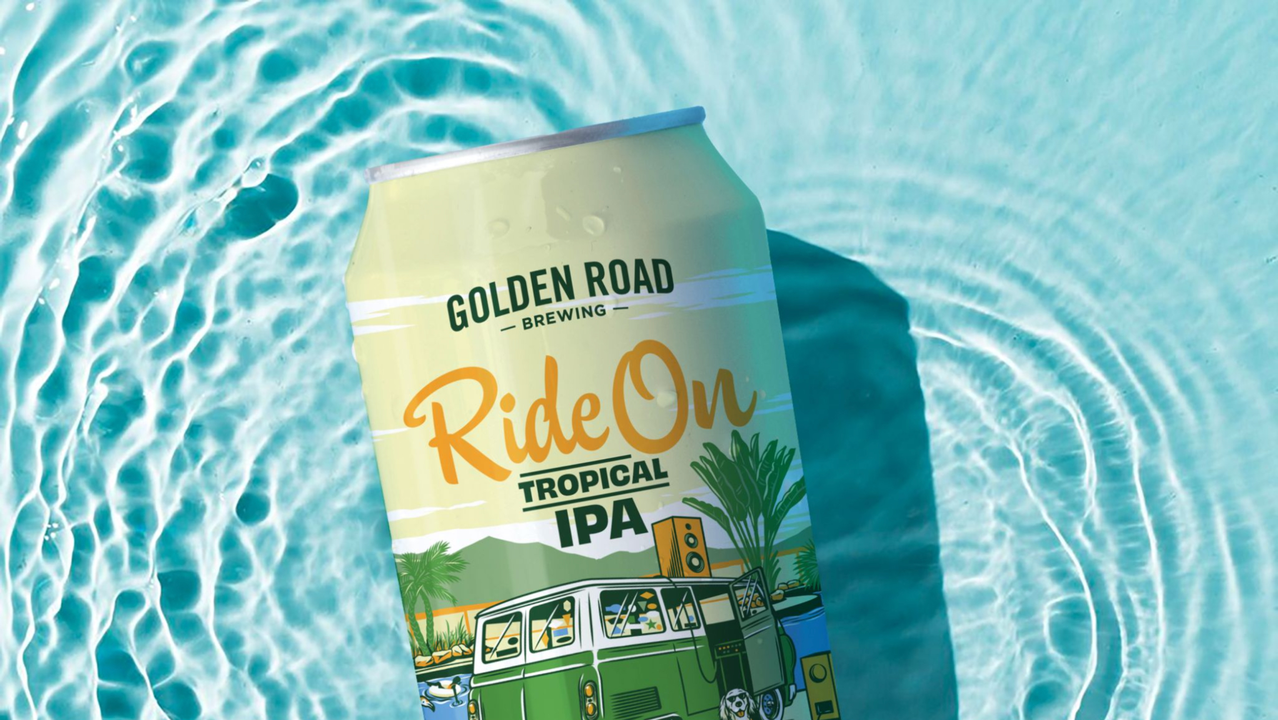
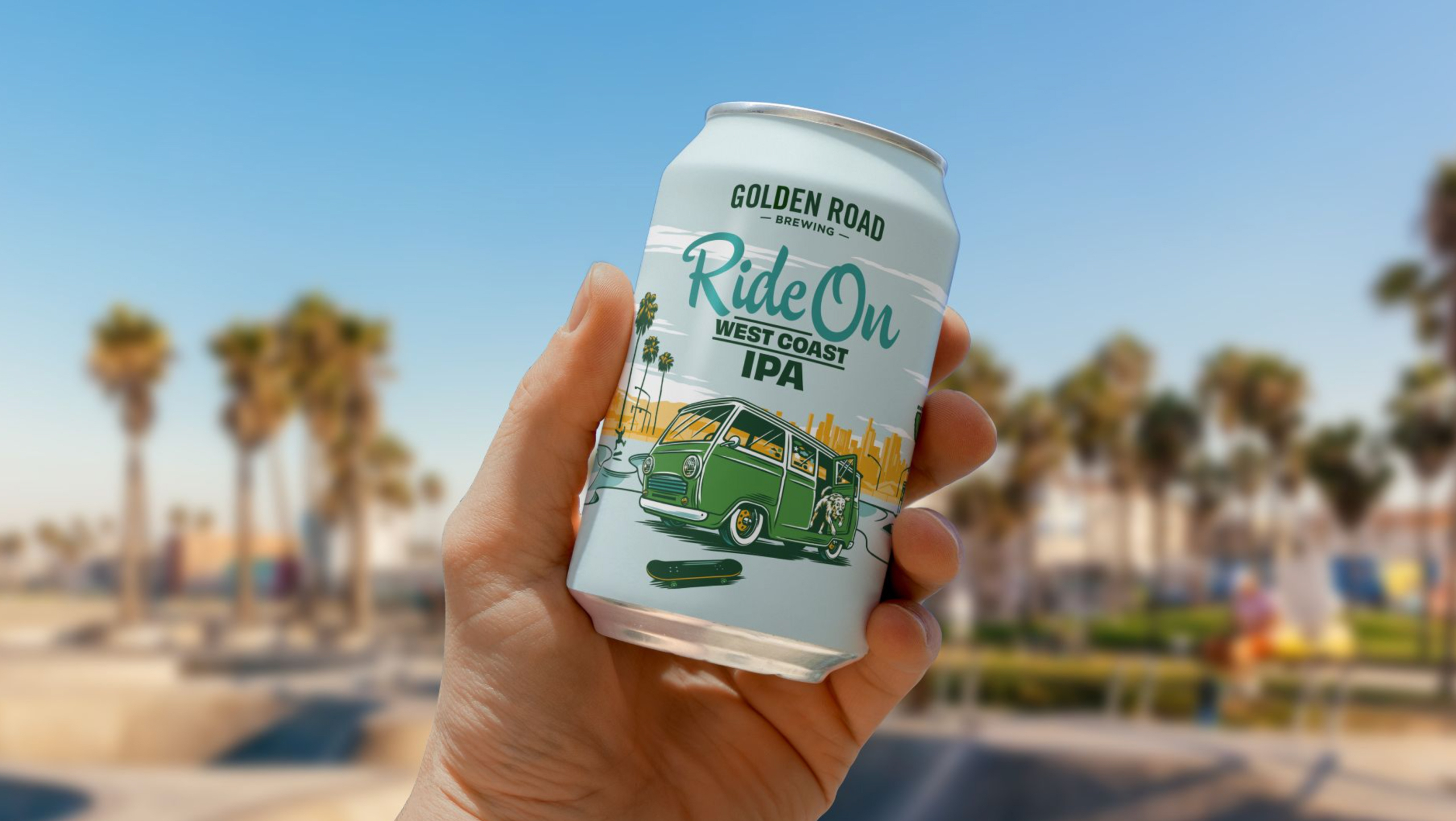
So we imagined a surf van, a canine companion and quintessential California days up and down the coast. We then enlisted illustrator KidMarkie to bring that vision to vivid life. We steered clear of blacks and silvers and heavy metal iconography, instead shifting to a pastel palette more reflective of the brand’s easy-going golden state of mind. A script font offers a casual introduction rather than the standard shouting type of typical IPAs.
One last consideration was scalability. The brand wanted to be able to add new beers to the series over time. So our look is created to have the flexibility to imagine new scenes while maintaining enough consistent elements and coloration to keep a cohesive brand feel.
Work + News
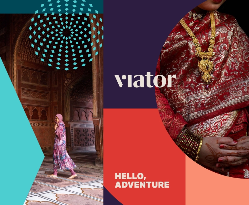
A wanderlust-worthy rebrand
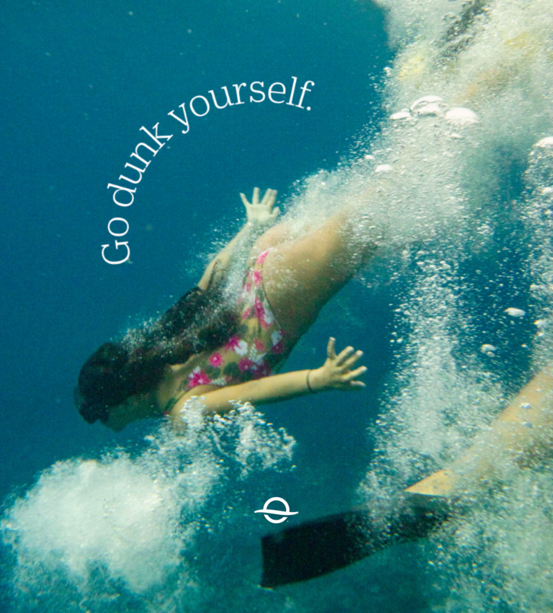
Inspired by the shapes and colors of dream destinations, DC rebrands Viator for a new wave of planning-adverse adventurers.
Voyaging past the reef
Ahead of their 75th anniversary, our friends at Outrigger Resorts asked us to help elevate the brand for a global stage.
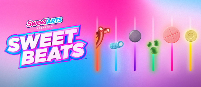
Eat to the beat with SweeTARTS
Launching today, the SweetBEATS mixer lets fans create musical loops, share them with friends, and enter for a chance to win a one-on-one virtual studio session with pop legend Christina Aguilera.
Rakuten
Loyalty or discount program advertising often dwells in the downscale world of the coupon clipper — a turnoff to savvier online shoppers. Our strategy was to present Rakuten as every bit as premium as the brands it offered rebates on.

StubHub
Even the mild-mannered have something inside that drives them wild. And thanks to StubHub that wild thing is busting out all over.
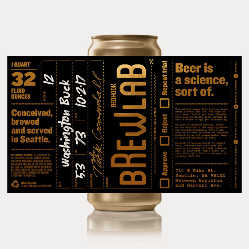
Redhook Brewlab
Craft beer is like indie music. If you get too popular, you’re no longer cool. Just ask Redhook. In the early ’80s, they took off like a rocket, Anheuser Busch came calling and the brand was labeled a sellout. “Budhook!” the beer nerds snickered.
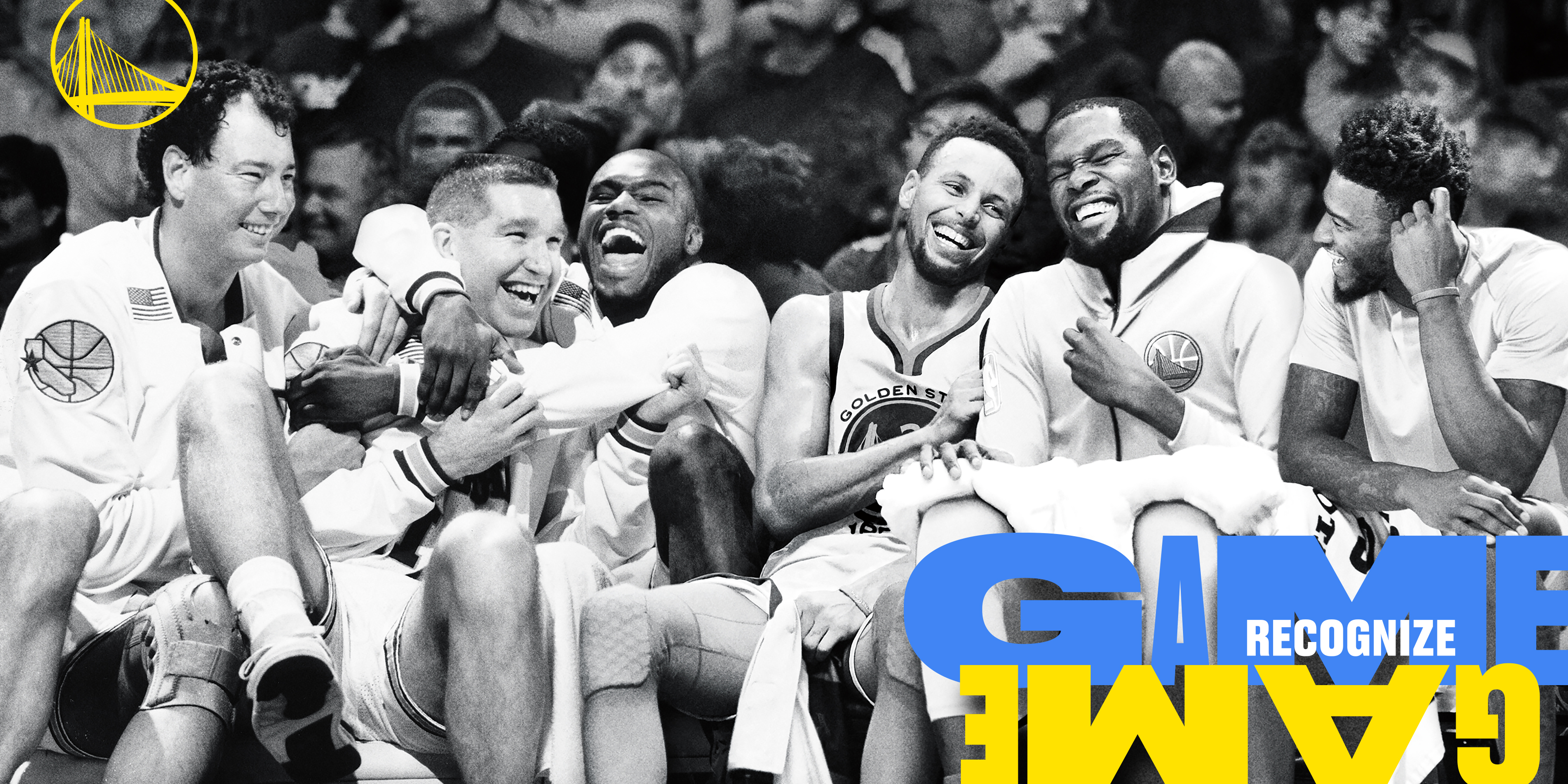
Golden State Warriors
One of the greatest teams ever assembled was just about to leave the city that supported them through thick and thin for 47 years. How do they say good-bye?
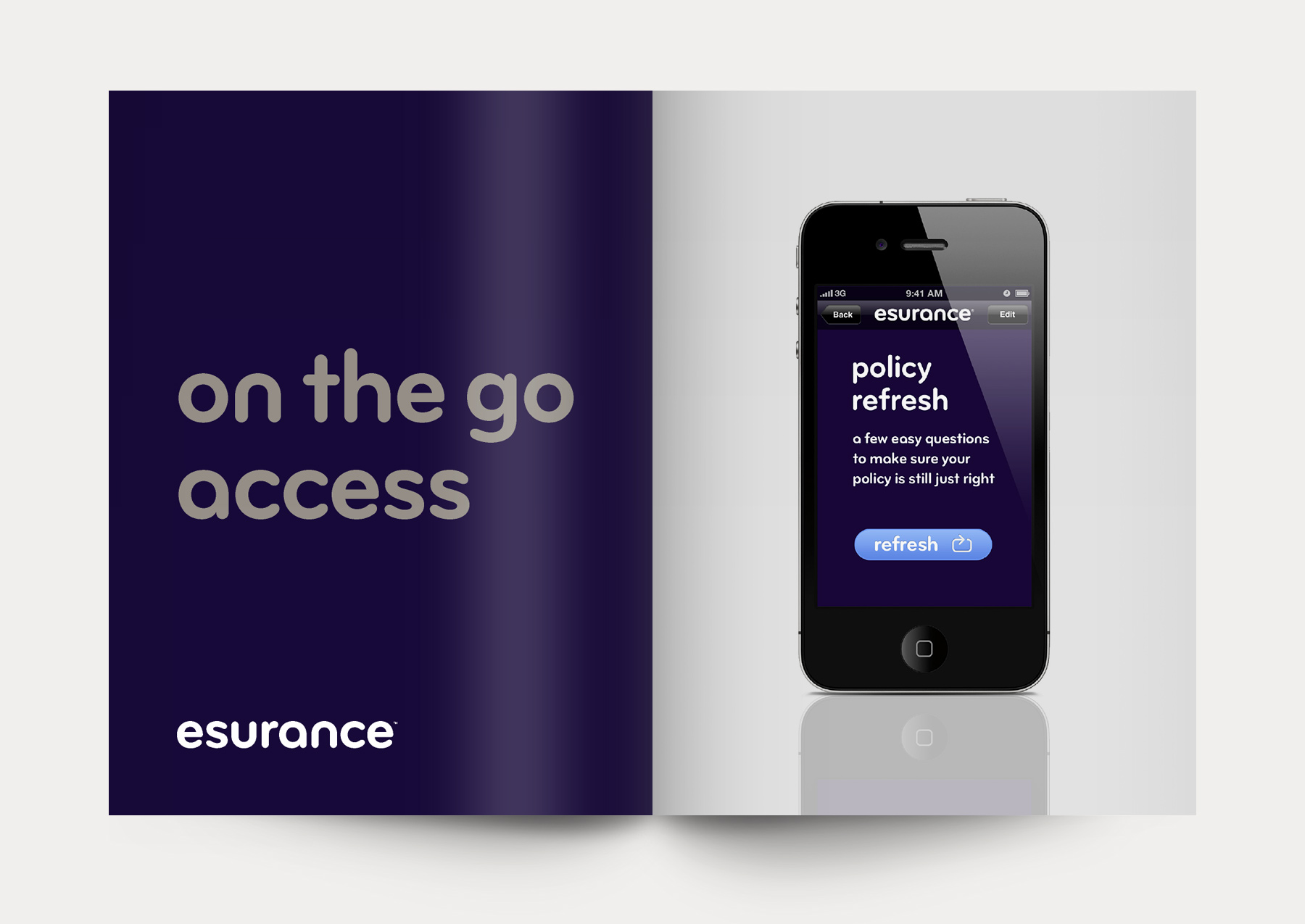
Esurance
To keep growing, this pioneering online car insurer, which had catered to a younger demo, needed to persuade older, more discerning consumers of its stability, reliability and humanity.
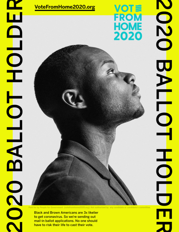
“They can’t take your ballot”
At a time of unprecedented voter suppression, the mission of Vote From Home 2020 is more essential than ever. Our new “Suppress This” campaign helps them get ballots into the hands of disenfranchised voters of color. You can help, too.
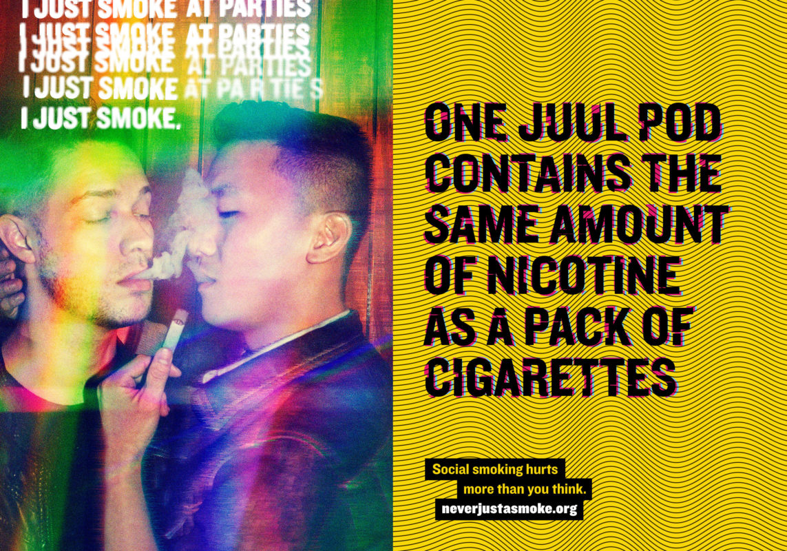
California Tobacco Control · Social Smoking
Daily smoking has been on the decline for decades and yet casual smoking is actually on the rise. How do we get at-risk groups to see social smoking for what it is: plain old dangerous, unhealthy smoking.

Udemy
DC developed a stylish back-to-school look for this growing learning platform. A new brand identity and comprehensive visual system celebrated the diversity of teachers and students and brought humanity to a previously transactional-feeling platform.
DC site takes top Pixel Award
Thirty-two industry judges bestowed top prize on D/C in the non-profit category of the 10th annual Pixel Awards.