•
Posted in
News
That’s right, upside-down and backwards: Vertigo ID
“You should have been there when we presented this one,” says creative director Mike Lemme. The proposed new mark, taking off from the company’s name, is a type treatment of that name upside-down and/or backwards.
It’s not just a stunt. The meaning of the company’s name, of course, is the first thing that motivates this mark. But the audacity of the logo speaks loudly and clearly to the audacity of the company, which is known for solving the knottiest software development problems. There’s also the affinity of the company’s primary technical audience (not to mention its secondary audience, Vertigo’s internal staff) for visual conundrums, for a clever little challenge that demands the application of their own cleverness.
The branding work didn’t, of course, stop at the logo. It also encompassed a comprehensive brand book, graphic standards, a re-design of the website, a portfolio of graphic templates, and more.
The fun, puzzling nature of the mark and the obsessive precision of the system has energized the client’s organization and impressed customers and friends alike. It has earned D/C a gold statue in the San Francisco ADDYs and an entry into the national ADDYs. And, perhaps best of all, Vertigo has just closed books on their best year ever.
Work + News

Horizon Organic did not come to play.
In DC’s new campaign the organic dairy trailblazer takes nutrition as seriously as kids navigating a floor covered in make believe lava. That is to say: very, very seriously.

DC’s strategy team brings home an esteemed Jay Chiat Award
Duncan Channon’s "Nicotine Equals" campaign strategy, intended to awaken parents to the teen vaping epidemic, got the judges attention at this year’s 4A’s Jay Chiat Awards.

“We’ve changed!” says Big Tobacco
Guess what, all? The industry that’s responsible for more death and disease than any other and continues to peddle six trillion cigarettes a year is now your friend. Go figure.
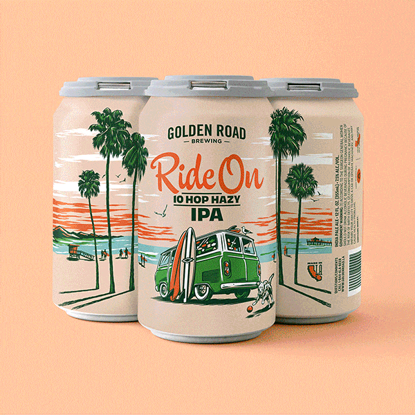
A new spin on IPA packaging
Most IPA cans today look like they were designed by the dude that did the Iron Maiden albums. All skulls and green lightning, giving full testosterone and acne vibes. So when tasked with driving a new look for Golden Road’s Ride On series, we banged a uey.

A wanderlust-worthy rebrand
Inspired by the shapes and colors of dream destinations, DC rebrands Viator for a new wave of planning-adverse adventurers.

Kona Big Wave goes even bigger
After a decade of leading creative for Kona Big Wave, DC’s “Bring the Aloha” campaign relaunches the brand for a broader audience, moving beyond its craft roots to a priority position in AB InBev’s premium beer portfolio.

InnovAsian finds balance, and big results.
A blend of content creators and traditional photoshoots was the perfect recipe to increase InnovAsian’s engagement on social – without breaking the budget.

DC appoints first Managing Director, Kumi Croom
A game changer since her arrival six years ago, Kumi will lead account and project management and continue to shape DC’s culture and client relationships.

Empathy over stigma
DC is honored to have been selected by the state of CA to tackle one of the most challenging issues of our generation. And to be covered in AdAge.

This Golden Road work isn’t good
People always ask: You good? But that indicates a pretty baseline, “just okay” type of good. DC’s new campaign for Golden Road asks a question that aims a little higher from a city that does the same.

El Secreto esta en el balance
Nuestro nuevo comercial para la cerveza Mango Cart de Golden Road establece una conexión alegre entre la tradición Mexicana de bailar mientras se equilibra una cerveza abierta en la cabeza con el sabor de la deliciosa cerveza con infusión de mango de Golden Road.

Drink to the future
Organic wine industry pioneer, Bonterra Organic Estates, bolsters brand leader status with a future forward, fashionably chic campaign from DC.
Contact Us
New business
NOËL JOHNSON
Dir of marketing and client engagement
njohnson@duncanchannon.com
415 306 9237
Jobs, creative
TINA MONTEMAYOR
Dir of creative talent acquisition + equity
tmontemayor@duncanchannon.com
415 306 9282