


•
Posted in
News
California debuts ads to counter e-cigs


The creative was conceived and produced by Duncan Channon, which is also planning and buying the media. Click over to stillblowingsmoke.org to see more of the campaign. But we thought that, just this once, we’d let the client do the talking:
Twenty-five years after launching the first anti-smoking advertisements in the state, the California Department of Public Health today premiered a series of television, digital, and outdoor ads in a new campaign called “Wake Up,” as part of its educational effort to inform the public about the dangers of e-cigarettes.
“California has been a world leader in tobacco use prevention and cessation since 1990, with one of the lowest youth and adult smoking rates in the nation. The aggressive marketing and escalating use of e-cigarettes threatens to erode that progress,” said Dr. Karen Smith, newly appointed CDPH director and state health officer.
CDPH recently released a report and health advisory highlighting areas of concern regarding e-cigarettes, including the sharp rise in e-cigarette use among California teens and young adults, the highly addictive nature of nicotine in e-cigarettes, the surge in accidental nicotine poisonings occurring in young children, and that secondhand ecigarette emissions contain several toxic chemicals. Research shows that youth and young adults who use e-cigarettes are far more likely to also use traditional cigarettes and other tobacco products.
“Our advertising campaign is telling the public to ‘wake up’ to the fact that these are highly addictive products being mass marketed,” said Dr. Smith.
The advertising campaign includes two TV ads that feature songs from the 1950s and ’60s and images portraying the health risks of e-cigarettes. One TV ad underscores the e-cigarette industry’s use of candy flavored “e-juice” and products that entice the next generation to become addicted to nicotine. The second TV spot emphasizes the dangers and addictiveness of e-cigarettes, while exposing the fact that big tobacco companies are in the e-cigarette business. E-cigarettes are largely unregulated at the federal level and companies are not required to disclose what is in their products or how they are made.
To inform the public about the dangers of e-cigarettes, CDPH launched an educational campaign in late January. The advertising component kicks off today and runs through June 2015, with TV and digital ads on websites, online radio and social media throughout the state. Outdoor ads, including billboards, at gas stations and in malls, and ads in movie theaters will be phased in throughout the campaign. This counter e-cigarette advertising campaign is part of CDPH’s ongoing anti- tobacco media efforts.
In addition to the advertising, the CDPH educational campaign will include:
Partnering with the local public health, medical, and child care organizations to increase awareness about the known toxicity of e-cigarettes and the high risk of poisonings, especially to children, while continuing to promote and support the use of proven effective cessation therapies.
Joining with the California Department of Education and school officials to assist in providing accurate information to parents, students, teachers, and school administrators on the dangers of e-cigarettes.
The California Tobacco Control Program was established by the Tobacco Tax and Health Protection Act of 1988. The act, approved by California voters, instituted a 25-cent tax on each pack of cigarettes and earmarked five cents of that tax to fund California’s tobacco control efforts. These efforts include supporting local health departments and community organizations, a media campaign, and evaluation and surveillance. California’s comprehensive approach has changed social norms around tobacco-use and secondhand smoke. California’s tobacco control efforts have reduced both adult and youth smoking rates by 50 percent, saved more than one million lives and have resulted in $134 billion worth of savings in health care costs. Learn more at UNDO.org.
Work + News
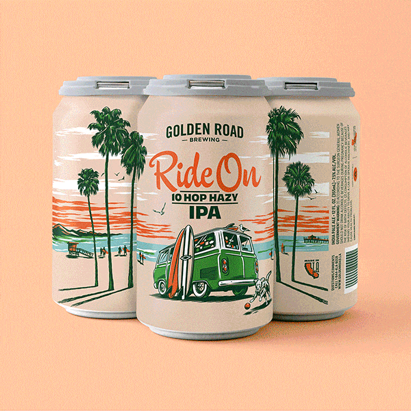
A new spin on IPA packaging
Most IPA cans today look like they were designed by the dude that did the Iron Maiden albums. All skulls and green lightning, giving full testosterone and acne vibes. So when tasked with driving a new look for Golden Road’s Ride On series, we banged a uey.

A wanderlust-worthy rebrand
Inspired by the shapes and colors of dream destinations, DC rebrands Viator for a new wave of planning-adverse adventurers.

Voyaging past the reef
Ahead of their 75th anniversary, our friends at Outrigger Resorts asked us to help elevate the brand for a global stage.

Eat to the beat with SweeTARTS
Launching today, the SweetBEATS mixer lets fans create musical loops, share them with friends, and enter for a chance to win a one-on-one virtual studio session with pop legend Christina Aguilera.

Rakuten
Loyalty or discount program advertising often dwells in the downscale world of the coupon clipper — a turnoff to savvier online shoppers. Our strategy was to present Rakuten as every bit as premium as the brands it offered rebates on.

StubHub
Even the mild-mannered have something inside that drives them wild. And thanks to StubHub that wild thing is busting out all over.

Redhook Brewlab
Craft beer is like indie music. If you get too popular, you’re no longer cool. Just ask Redhook. In the early ’80s, they took off like a rocket, Anheuser Busch came calling and the brand was labeled a sellout. “Budhook!” the beer nerds snickered.

Golden State Warriors
One of the greatest teams ever assembled was just about to leave the city that supported them through thick and thin for 47 years. How do they say good-bye?

Esurance
To keep growing, this pioneering online car insurer, which had catered to a younger demo, needed to persuade older, more discerning consumers of its stability, reliability and humanity.

“They can’t take your ballot”
At a time of unprecedented voter suppression, the mission of Vote From Home 2020 is more essential than ever. Our new “Suppress This” campaign helps them get ballots into the hands of disenfranchised voters of color. You can help, too.

Udemy
DC developed a stylish back-to-school look for this growing learning platform. A new brand identity and comprehensive visual system celebrated the diversity of teachers and students and brought humanity to a previously transactional-feeling platform.
DC site takes top Pixel Award
Thirty-two industry judges bestowed top prize on D/C in the non-profit category of the 10th annual Pixel Awards.

Hi, Volta
Congrats to our friends and clients Staffan Terje and Umberto Gibin on last night’s official opening in San Francisco of their latest culinary masterpiece Volta.

Stride Rite embraces the chaos
The world may change, but the joyful pandemonium of childhood remains a constant. Being no strangers to that joy ourselves, D/C was excited to be tapped to work on a brand refresh for Stride Rite. The new work encourages parents both to embrace the chaos and come prepared.

Making up with KVD Beauty
Inspired by KVD Beauty's tireless support of other makeup artists, the site is deeply collaborative, with products sitting side-by-side with user-generated photos and illustrations.

Formula X for Sephora
The breakthrough website — the first social network built for nail fans — puts the fun in functional.
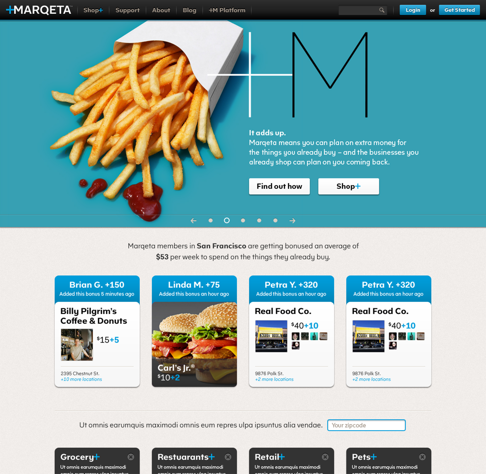
Marqeta
It’s a complex story and has to be delivered with authority, concision and style.
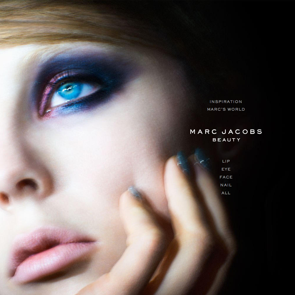
Sephora / Marc Jacobs Beauty
When fashion icon Marc Jacobs made his move into cosmetics, he picked Sephora for a partner. And Sephora picked DC. And the pressure was on to match up to the master’s incomparable style.
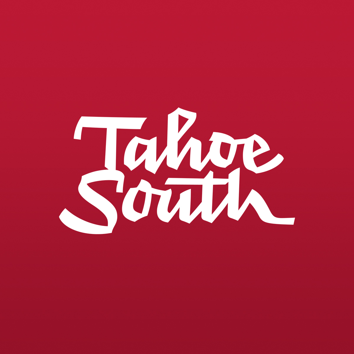
CA says Tahoe South’s just their type
Communication Arts has honored Duncan/Channon in this year’s prestigious Typography Annual for design of the new Tahoe South identity for the Lake Tahoe Visitors Authority.

Tahoe South
Lake Tahoe Visitors Authority takes the plunge on a new name, a brand overhaul and fresh advertising, embracing its rep as the lake’s wild side.

Blurb
Amid the glut of cheapo, on-demand books, this company stands for design, craftsmanship and beauty.

D/C gets happy
This fall, after galvanizing the British public, the happy egg co. is coming to the US. And, following a pitch, they hired a truly free-range agency – the uncageable Duncan/Channon – to develop a digital brand in the US.

Hard Rock
Work that earned top prize in the global Rebrand 100 competition, awarded for the combination of creative and strategy, and helped turn around a brand that turned rock stars into raving fans.

New wine, old bottle
The challenge for Farrier, the new luxe libation from Kendall-Jackson, was to bring in a sense of history, terroir and romance without dragging out the cliched oak barrels or little ole winemaker.

CA taps D/C
In a well-deserved tribute to the agency's interactive team, Duncan/Channon is being honored in this year's Communications Arts Interactive Annual for the Hard Rock Booth Interactive.

Ship-shape
Fifty-year-old Interasia was purchased by one of the world’s largest shipping firms, which wanted to reignite the enthusiasm of prospects, customers and its young employees.
Contact Us
New business
NOËL JOHNSON
Dir of marketing and client engagement
njohnson@duncanchannon.com
415 306 9237
Jobs, creative
TINA MONTEMAYOR
Dir of creative talent acquisition + equity
tmontemayor@duncanchannon.com
415 306 9282