Work
Intended specs are included below each example. Descriptions should match visuals when complete.

Full width image ^^^
Expand edge-to-edge in the viewport at all viewport widths / all breakpoints.
Wide width image ^^^
Match the max content width at all viewport widths / all breakpoints.
Ie: never expand edge-to-edge.
Eg: 1360 width at ≥1440 browser viewport width.
··········
[Below]
Align left/center/right – smaller images —
Match the max content width at all viewport widths / all breakpoints.
Ie: never expand edge-to-edge.
Eg: 1360 width at ≥1440 browser viewport width.
Unless…
When image dimensions of the component are set (width or height), those are max dimensions and the component aligns left, right or center to the viewport’s max content width (browser viewport width minus side the rails). This last allows us to set images to not exceed the body-text column width on desktop, for example (740), when desired, or any other value/%.
Align left, smaller image ^^^
Align center, smaller image ^^^
Align right, smaller image ^^^
··········
[Below]
Align left/center/right – large images —
Match the max content width at all viewport widths / all breakpoints.
Ie: never expand edge-to-edge.
Eg: 1360 width at ≥1440 browser viewport width.
Align left, large image ^^^
Align center, large image ^^^
Align right, large image ^^^
Full width video ^^^
Full width video (repeat) ^^^
Wide width video ^^^
Align left video ^^^

Full width image grid ^^^


Full width STACKED image grid ^^^
Wide width image grid ^^^
Wide width STACKED image grid ^^^

Full width slider with controls ^^^
Full width slider without controls ^^^
Wide width slider with controls ^^^
Wide width slider without controls ^^^
Lorem ipsum has been the industry’s standard dummy text ever since the 1500s, when an unknown printer took a galley of type and scrambled it to make a type specimen book.
Some dummy
Pullquote ^^^
Work + News
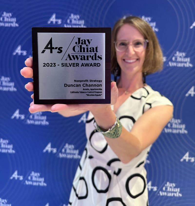
Jay Chiat Awards
Duncan Channon’s "Nicotine Equals" campaign strategy, intended to awaken parents to the teen vaping epidemic, got the judges attention at this year’s 4A’s Jay Chiat Awards.
“We’ve changed!” says Big Tobacco
Guess what, all? The industry that’s responsible for more death and disease than any other and continues to peddle six trillion cigarettes a year is now your friend. Go figure.
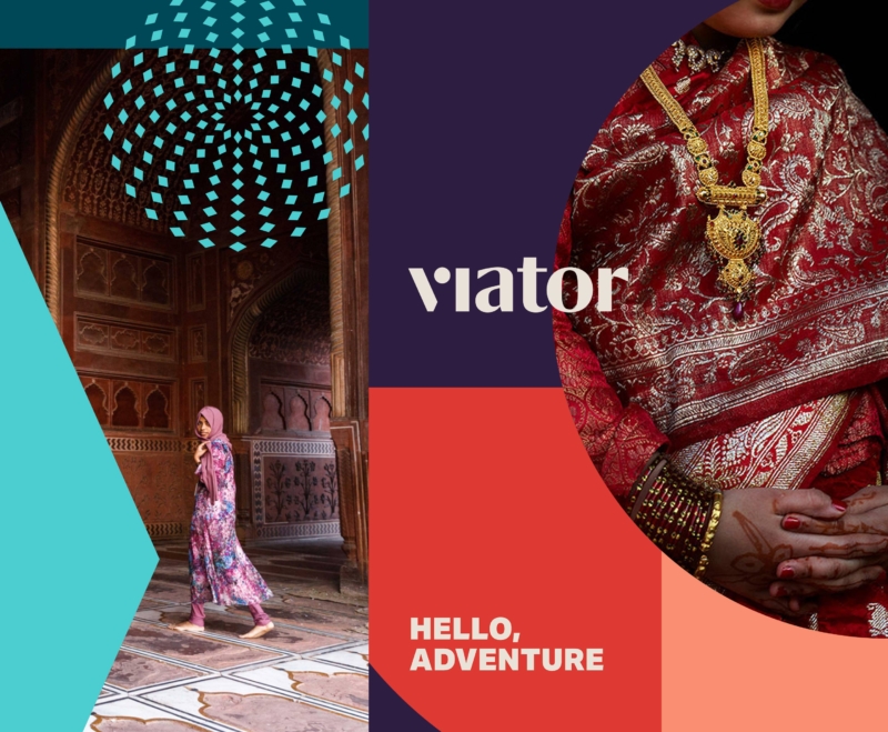
A wanderlust-worthy rebrand
Inspired by the shapes and colors of dream destinations, DC rebrands Viator for a new wave of planning-adverse adventurers.
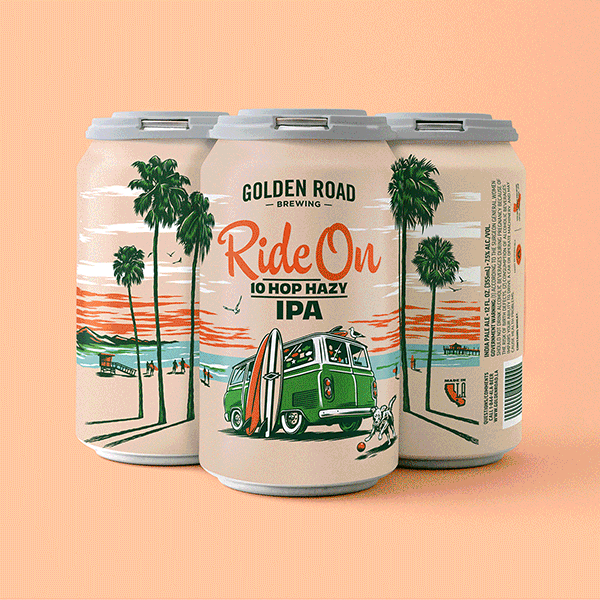
A new spin on IPA packaging
Most IPA cans today look like they were designed by the dude that did the Iron Maiden albums. All skulls and green lightning, giving full testosterone and acne vibes. So when tasked with driving a new look for Golden Road’s Ride On series, we banged a uey.
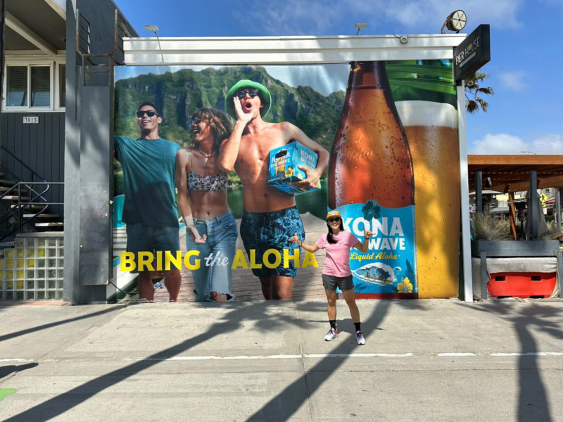
Kona Big Wave goes even bigger
After a decade of leading creative for Kona Big Wave, DC’s “Bring the Aloha” campaign relaunches the brand for a broader audience, moving beyond its craft roots to a priority position in AB InBev’s premium beer portfolio.
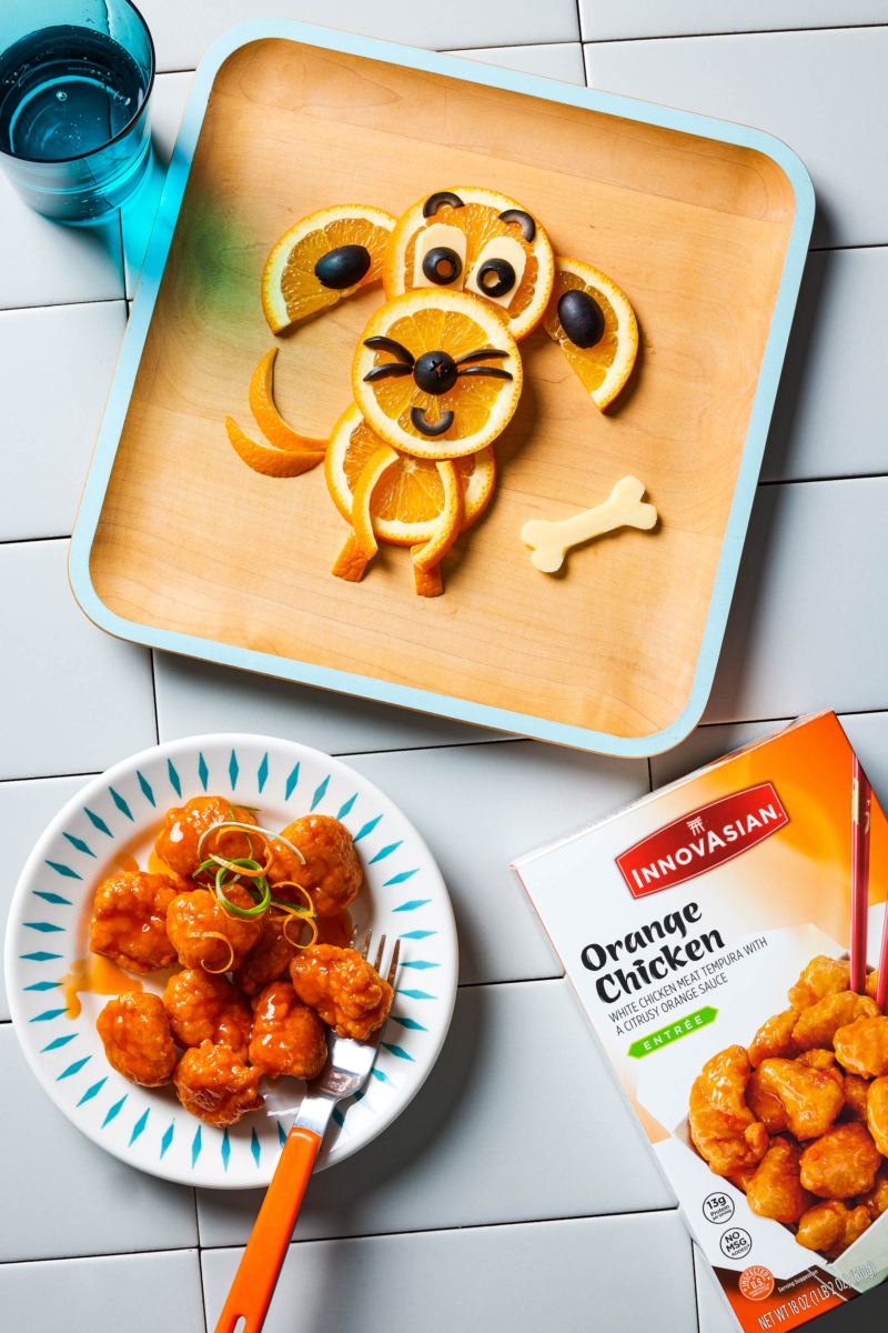
InnovAsian finds balance, and big results.
A blend of content creators and traditional photoshoots was the perfect recipe to increase InnovAsian’s engagement on social – without breaking the budget.

DC appoints first Managing Director, Kumi Croom
A game changer since her arrival six years ago, Kumi will lead account and project management and continue to shape DC’s culture and client relationships.
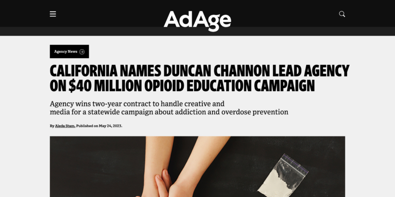
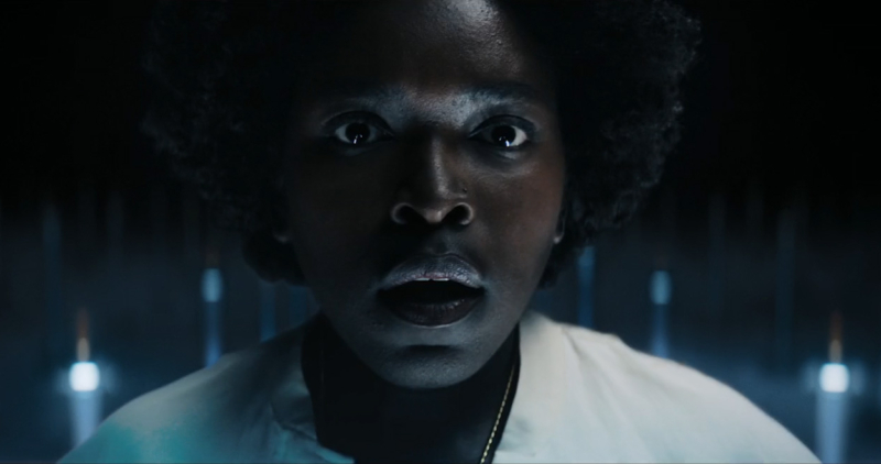
Empathy over stigma
DC is honored to have been selected by the state of CA to tackle one of the most challenging issues of our generation. And to be covered in AdAge.
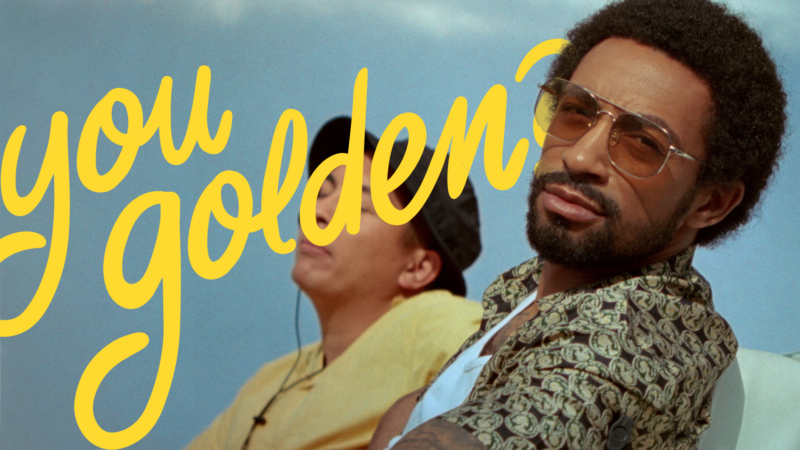
This Golden Road work isn’t good
People always ask: You good? But that indicates a pretty baseline, “just okay” type of good. DC’s new campaign for Golden Road asks a question that aims a little higher from a city that does the same.
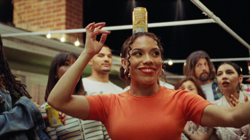
El Secreto esta en el balance
Nuestro nuevo comercial para la cerveza Mango Cart de Golden Road establece una conexión alegre entre la tradición Mexicana de bailar mientras se equilibra una cerveza abierta en la cabeza con el sabor de la deliciosa cerveza con infusión de mango de Golden Road.
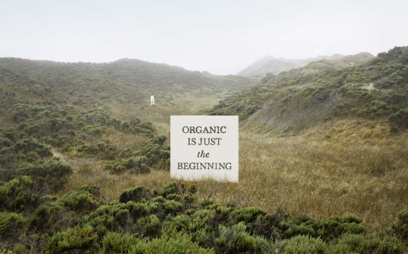
Drink to the future
Organic wine industry pioneer, Bonterra Organic Estates, bolsters brand leader status with a future forward, fashionably chic campaign from DC.
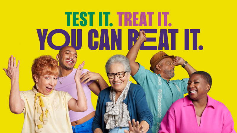
Test it. Treat it. You can beat it.
COVID fatigue is real, but so are the treatments. Pushing through that barrier with a sing-along? Now that’s contagious in the best way.
InnovAsian finds balance, and big results.
A blend of content creators and traditional photoshoots was the perfect recipe to increase InnovAsian’s engagement on social – without breaking the budget.
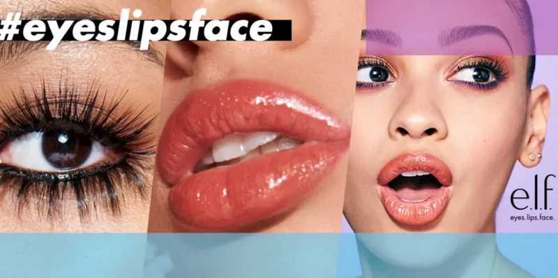
TikTok campaign breaks records
e.l.f. celebrates self-expression and individuality with beauty products for every #eyeslipsface through the most viral organic TikTok campaign ever created.
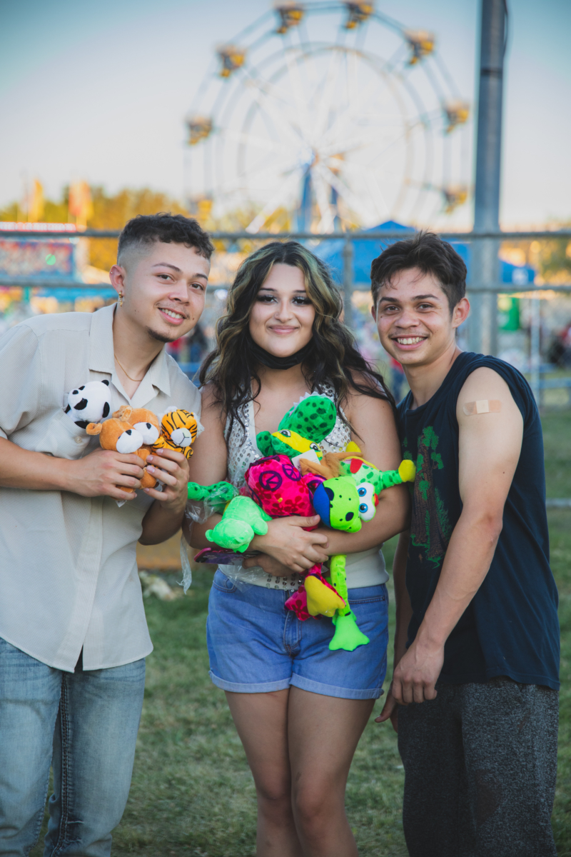
When the clinic’s a carnival
How do you convince a particularly hesitant group of Californians to get vaccinated for Covid-19? With free games, music, food, slushies and a great big Ferris wheel.
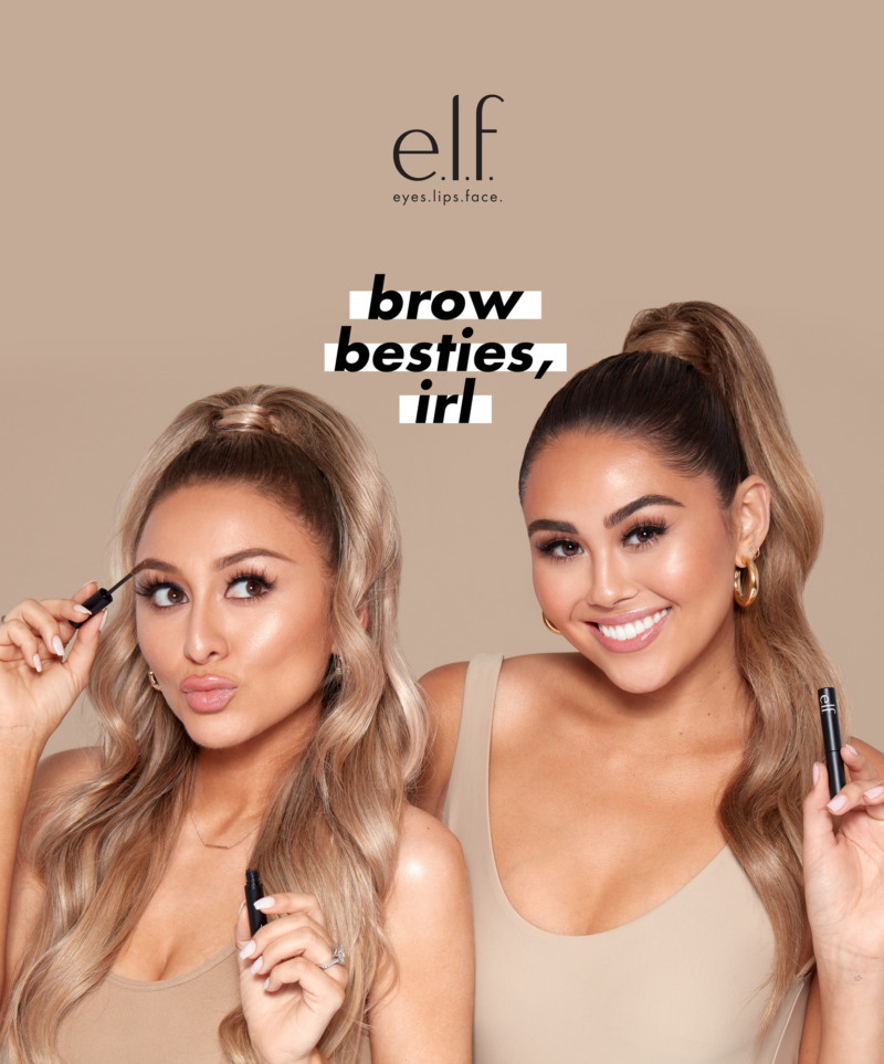
Brow besties, IRL
To re-energize their brow line, e.l.f. rolled out a digital campaign with real-life besties and beauty influencers Roxette Arisa and Yesenia Hipolito, and celebrated with a fabulous dinner produced by DC.
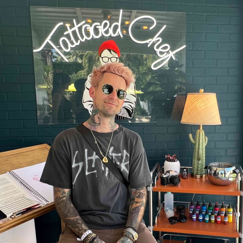
Coachella x Tattooed Chef
DC’s experiential team partnered with Tattooed Chef—bringing the brand’s edgy, purpose-driven ethos to life at Coachella’s 2022 return.
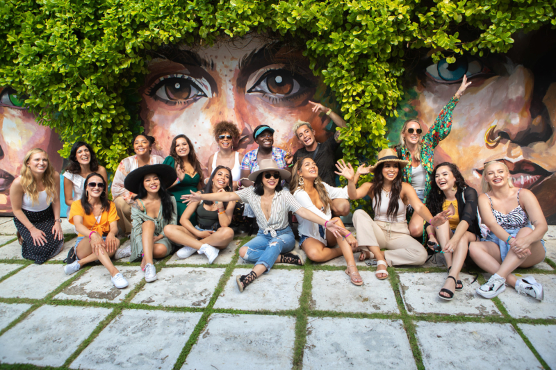
Beautyscape in the Bahamas
Created by DCLA for e.l.f., the fifth installment of the award-winning influencer program is now underway in the Bahamas. And garnering more heat than ever.
CBS x Alfred Coffee · Emmy Awards
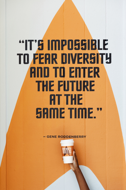
DCLA partnered CBS Studios with Alfred Coffee to reach Emmy voters and garner support for Star Trek: Picard. The timely work tapped into the diversity and inclusion central to Gene Roddenberry’s original vision.
Gap · Dress Normal
Gap asked us to build consideration and generate trial for their newly launched “Dress Normal” brand platform. Thirty influential Instagram photogs helped us do just that.
Nabela Noor for e.l.f.
DCLA created a can’t-miss launch event for Bangladeshi-American sensation Nabela Noor’s collaboration with e.l.f. Cosmetics.
Gap
With the Be Bright campaign, we secured the rights for Gap to be the official concert tee at the summer’s hottest music festivals.
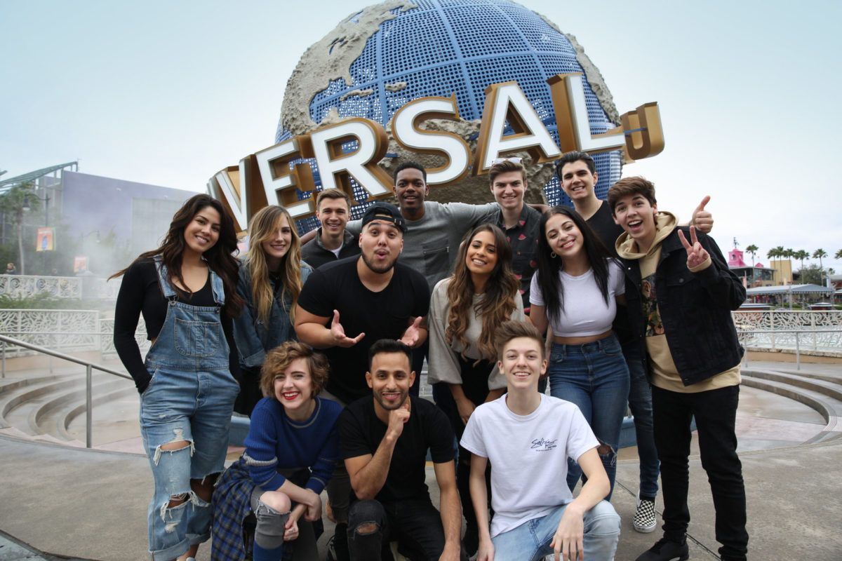
Universal Orlando
Universal Orlando leveraged DCX’s stable of influencers to reach the difficult-to-reach teen and tween audience — and succeeded 40 million times over.
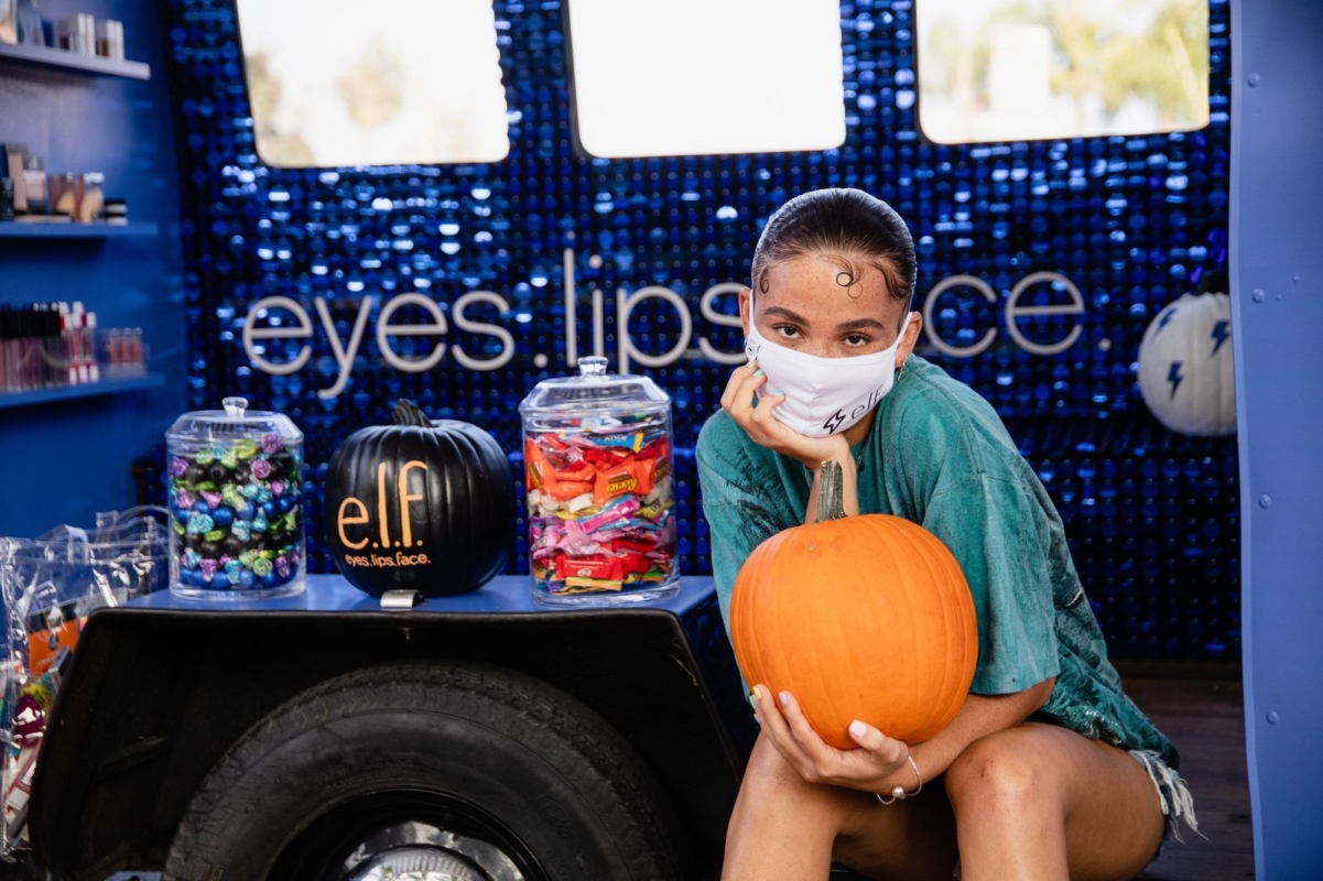
e.l.f. 2020 Halloween activation
Duncan Channon’s LA team kept the halloween spirit alive by bringing a spooky holiday pop-up straight to beauty influencers’ homes.