News
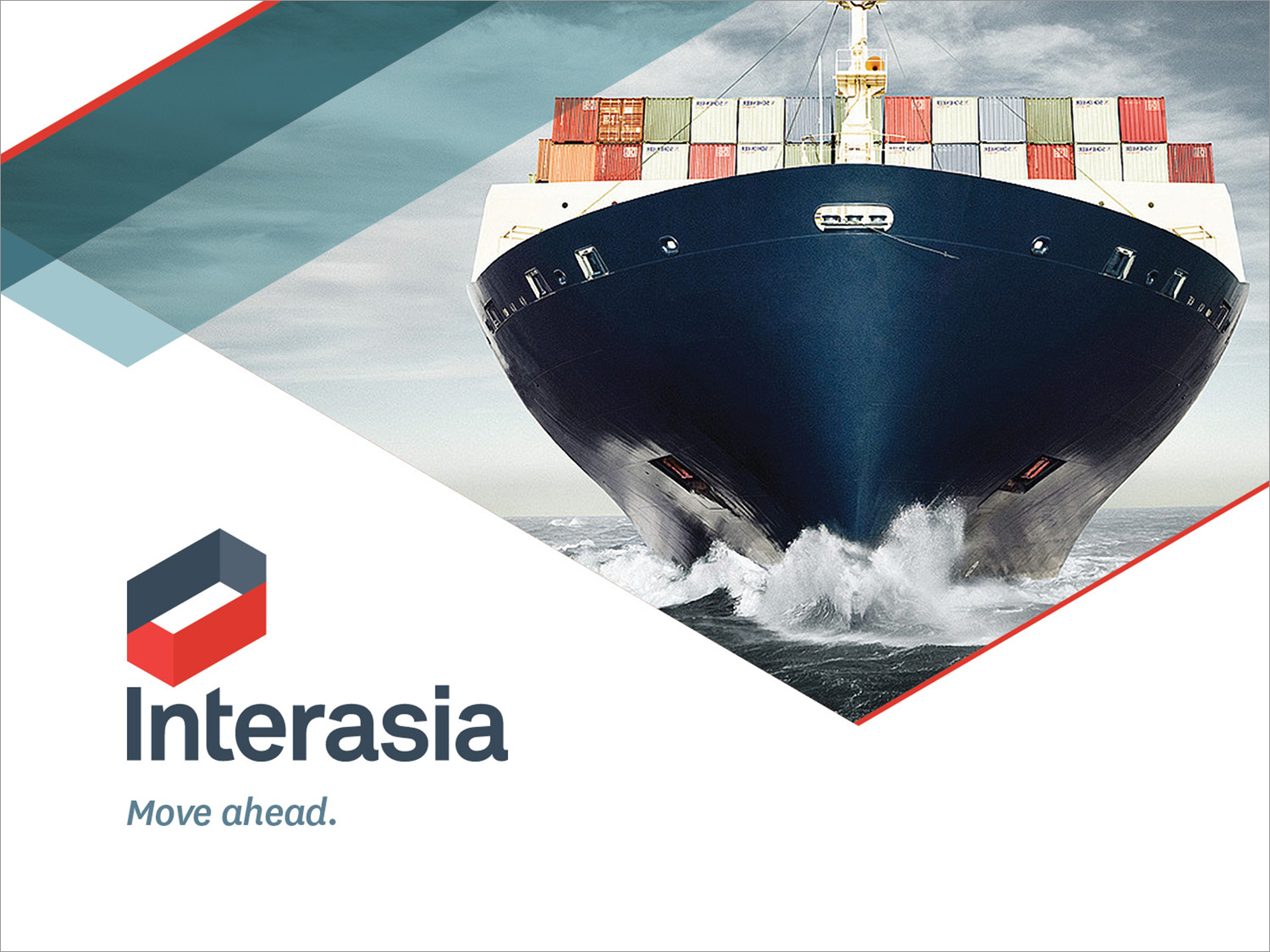
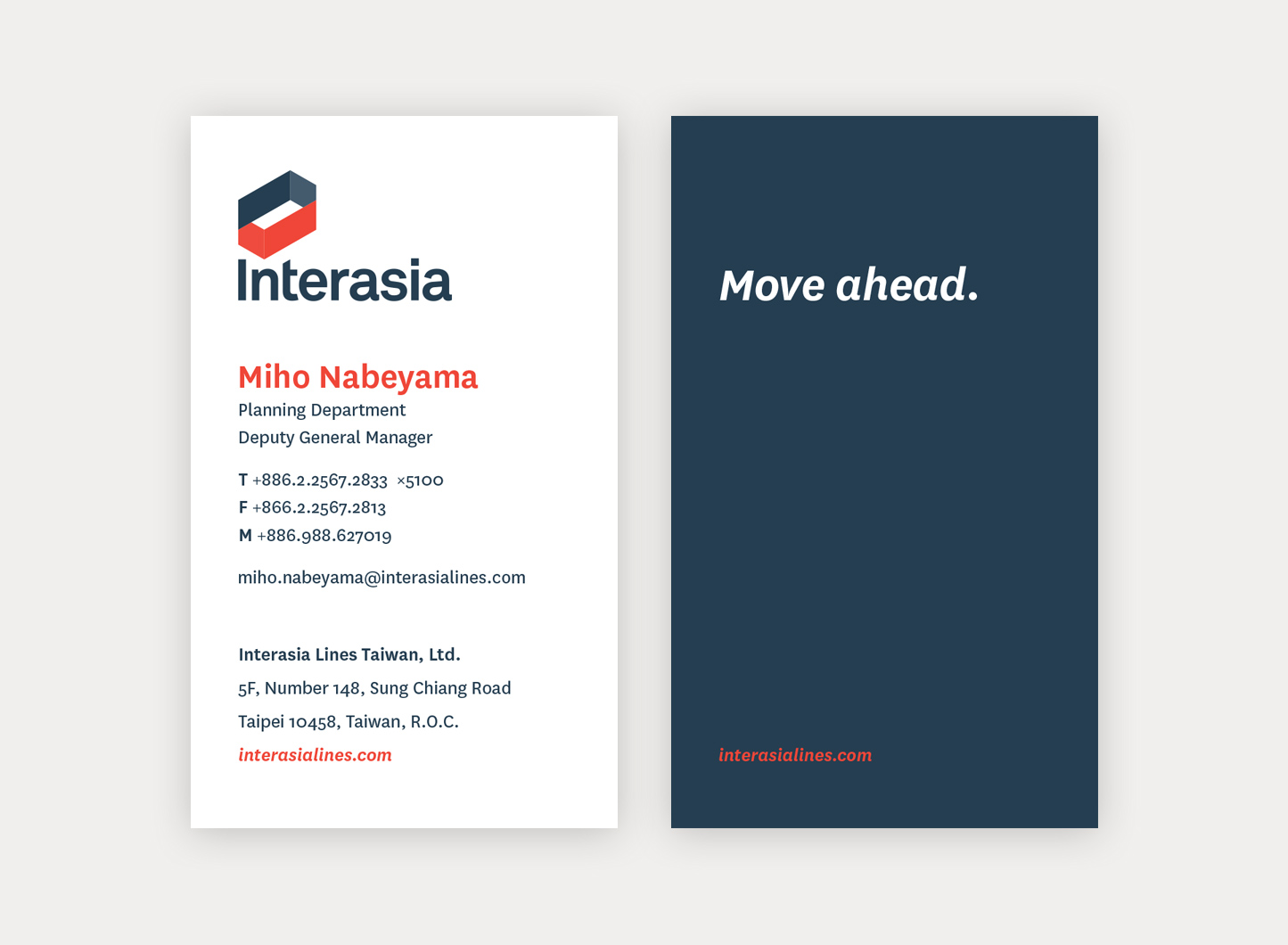
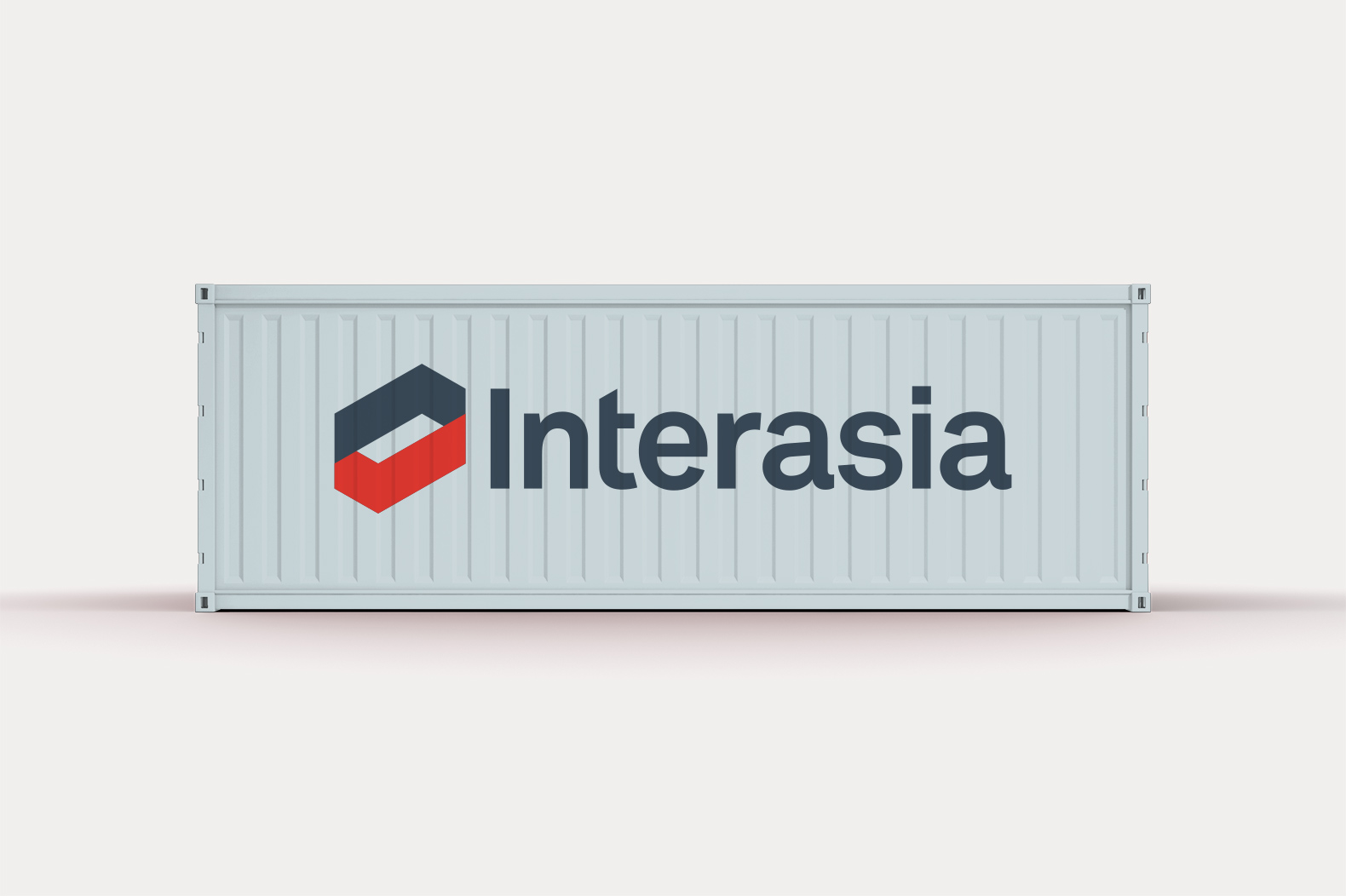
Fifty-year-old Interasia was purchased by one of the world’s largest shipping firms, which wanted to reignite the enthusiasm of prospects, customers and its young employees. And show, no less than its customer companies, that the new Interasia was contemporary and future-facing. In addition to a full ID system, the project included designs for ships and containers and required DC creatives to undergo a crash course in the antiquated methods of the container-painting industry and consult with a South San Francisco body shop. The new logo not only resembles a container, but shows motion and dimension, in striking colors.
Work + News
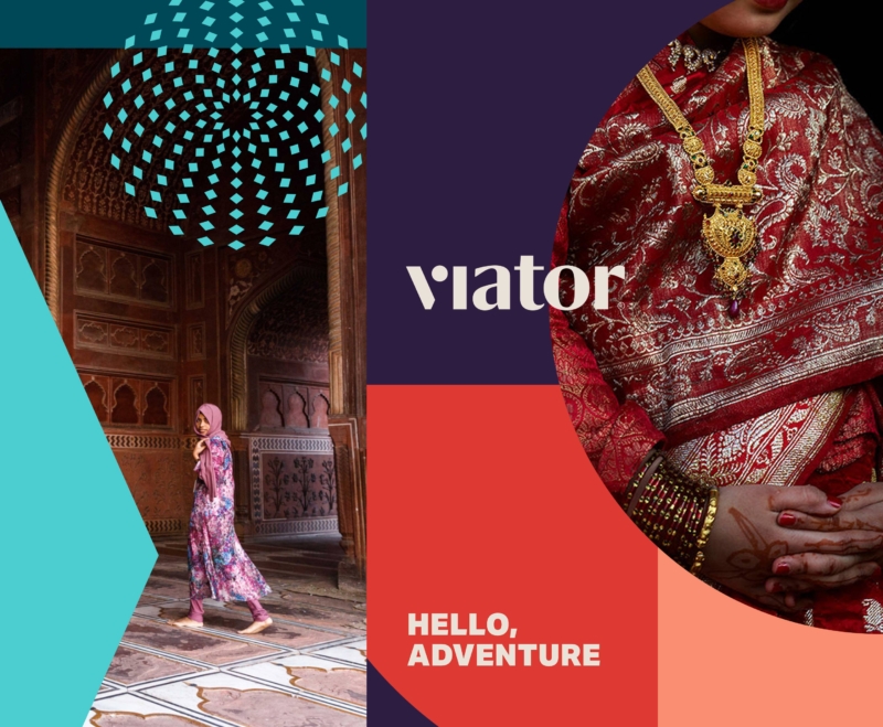
A wanderlust-worthy rebrand
Inspired by the shapes and colors of dream destinations, DC rebrands Viator for a new wave of planning-adverse adventurers.
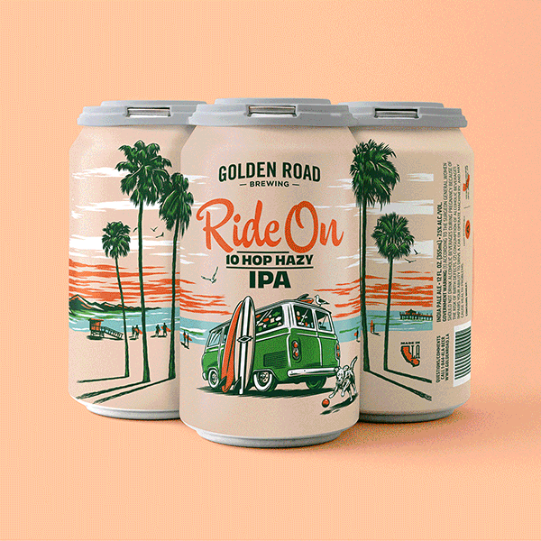
A new spin on IPA packaging
Most IPA cans today look like they were designed by the dude that did the Iron Maiden albums. All skulls and green lightning, giving full testosterone and acne vibes. So when tasked with driving a new look for Golden Road’s Ride On series, we banged a uey.
Voyaging past the reef
Ahead of their 75th anniversary, our friends at Outrigger Resorts asked us to help elevate the brand for a global stage.
Rakuten
Loyalty or discount program advertising often dwells in the downscale world of the coupon clipper — a turnoff to savvier online shoppers. Our strategy was to present Rakuten as every bit as premium as the brands it offered rebates on.
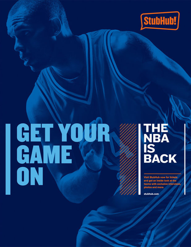
StubHub
Even the mild-mannered have something inside that drives them wild. And thanks to StubHub that wild thing is busting out all over.
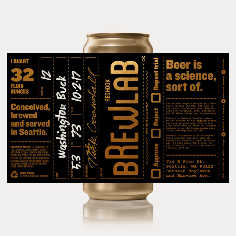
Redhook Brewlab
Craft beer is like indie music. If you get too popular, you’re no longer cool. Just ask Redhook. In the early ’80s, they took off like a rocket, Anheuser Busch came calling and the brand was labeled a sellout. “Budhook!” the beer nerds snickered.
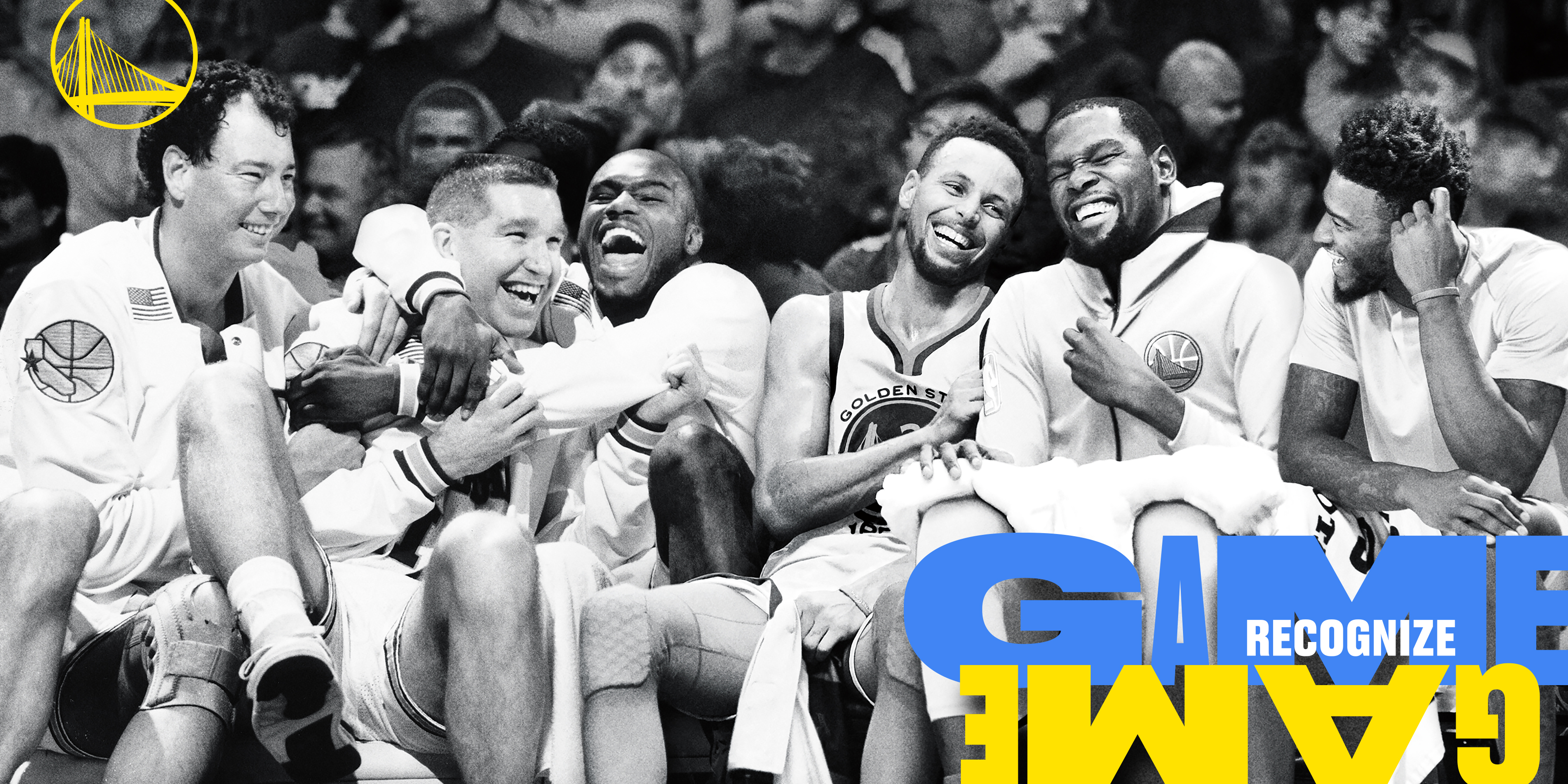
Golden State Warriors
One of the greatest teams ever assembled was just about to leave the city that supported them through thick and thin for 47 years. How do they say good-bye?
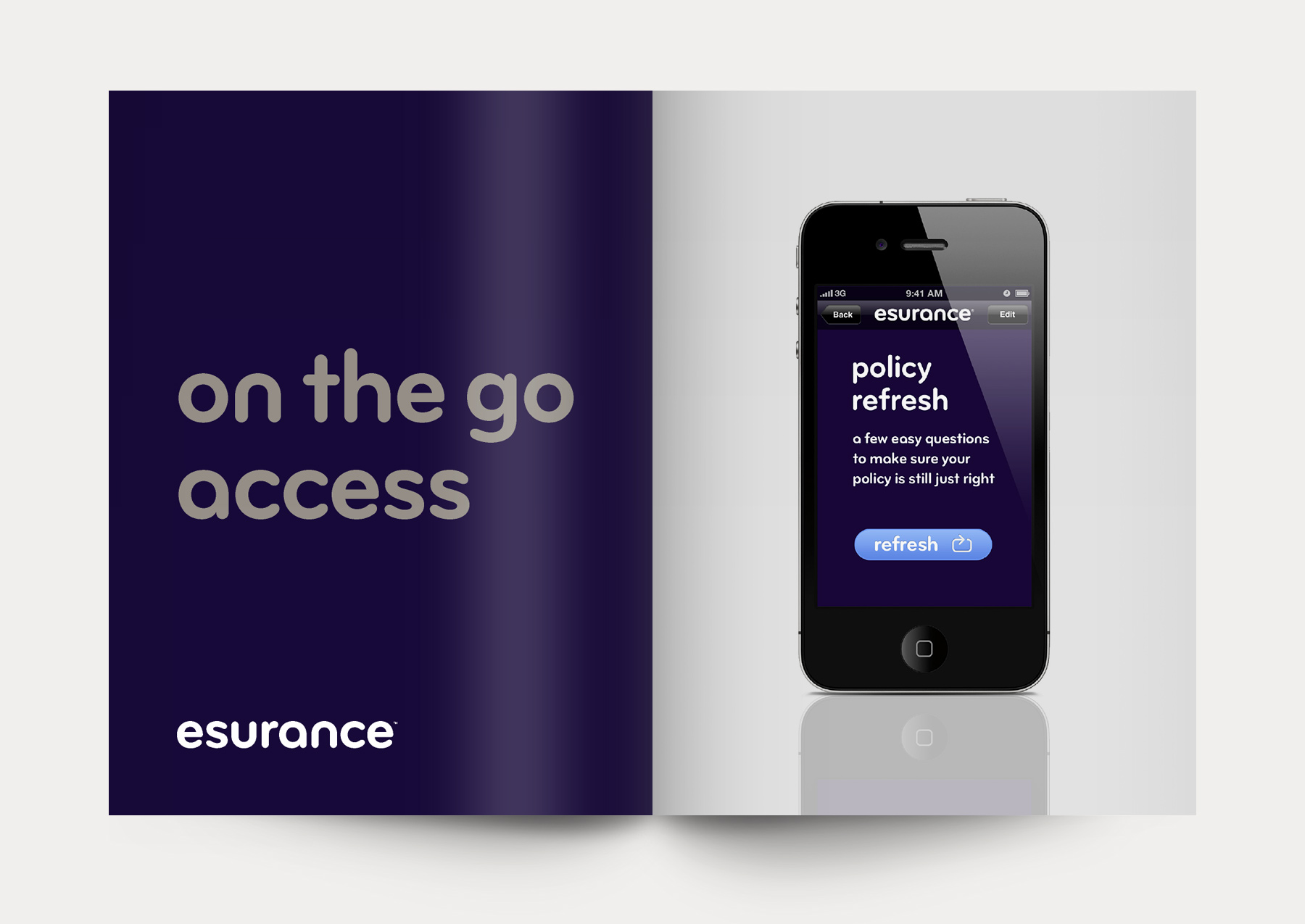
Esurance
To keep growing, this pioneering online car insurer, which had catered to a younger demo, needed to persuade older, more discerning consumers of its stability, reliability and humanity.
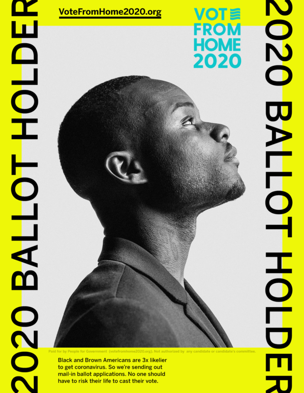
“They can’t take your ballot”
At a time of unprecedented voter suppression, the mission of Vote From Home 2020 is more essential than ever. Our new “Suppress This” campaign helps them get ballots into the hands of disenfranchised voters of color. You can help, too.

Udemy
DC developed a stylish back-to-school look for this growing learning platform. A new brand identity and comprehensive visual system celebrated the diversity of teachers and students and brought humanity to a previously transactional-feeling platform.
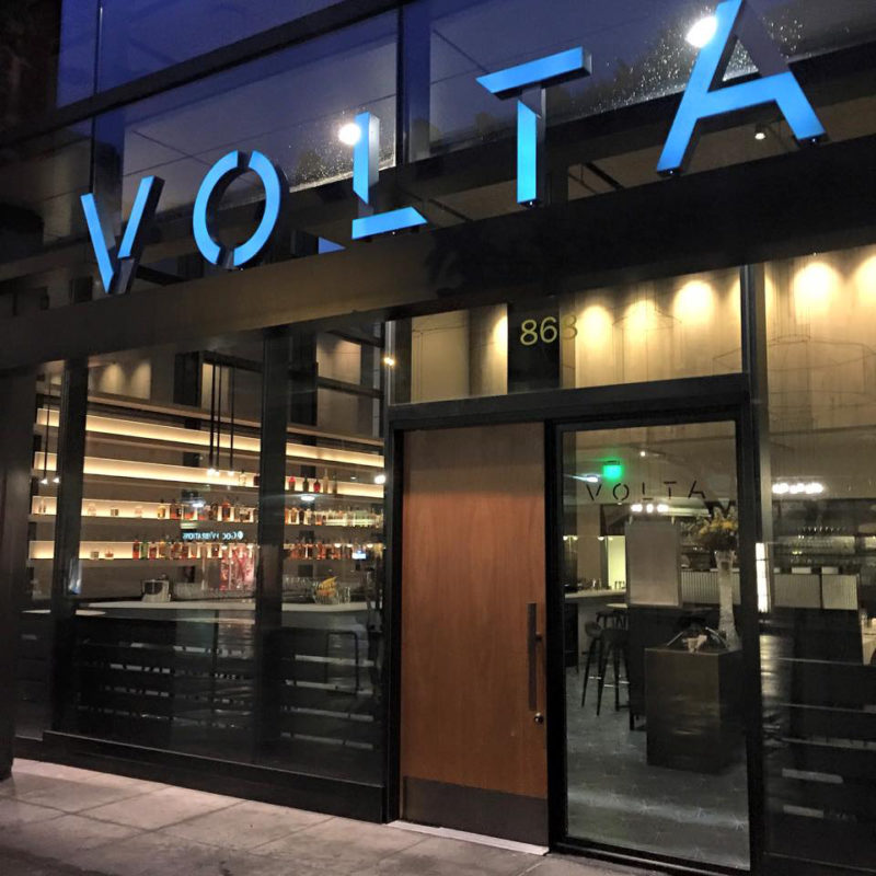
Hi, Volta
Congrats to our friends and clients Staffan Terje and Umberto Gibin on last night’s official opening in San Francisco of their latest culinary masterpiece Volta.

Stride Rite embraces the chaos
The world may change, but the joyful pandemonium of childhood remains a constant. Being no strangers to that joy ourselves, D/C was excited to be tapped to work on a brand refresh for Stride Rite. The new work encourages parents both to embrace the chaos and come prepared.